Before moving into illustration I was certain I wanted to get my hands onto Corporate Designs and other Communicational things. These works were practises and projects from that time (~2016-2018).
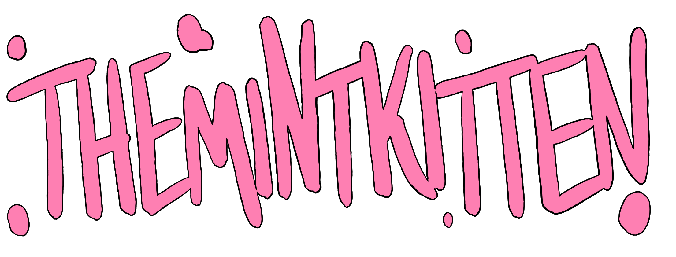
This logo design was for a fictional fashion brand trying to appeal to alternate fashion enthusiasts centering around japanese fashion especially. Their shop featured a great variety of styles including Lo-
lita, Fairy Kei, Visual Kei and a lot in between. The logo should represent both sides - the cute and the "devilish side" while also catering to a younger audience and attracting potential new comers to japanese fashion scenes.
lita, Fairy Kei, Visual Kei and a lot in between. The logo should represent both sides - the cute and the "devilish side" while also catering to a younger audience and attracting potential new comers to japanese fashion scenes.

Logo-Design for a fictional Harajuku Fashion Brand
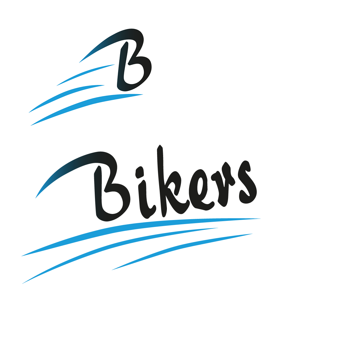
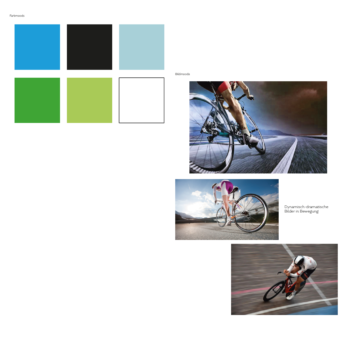
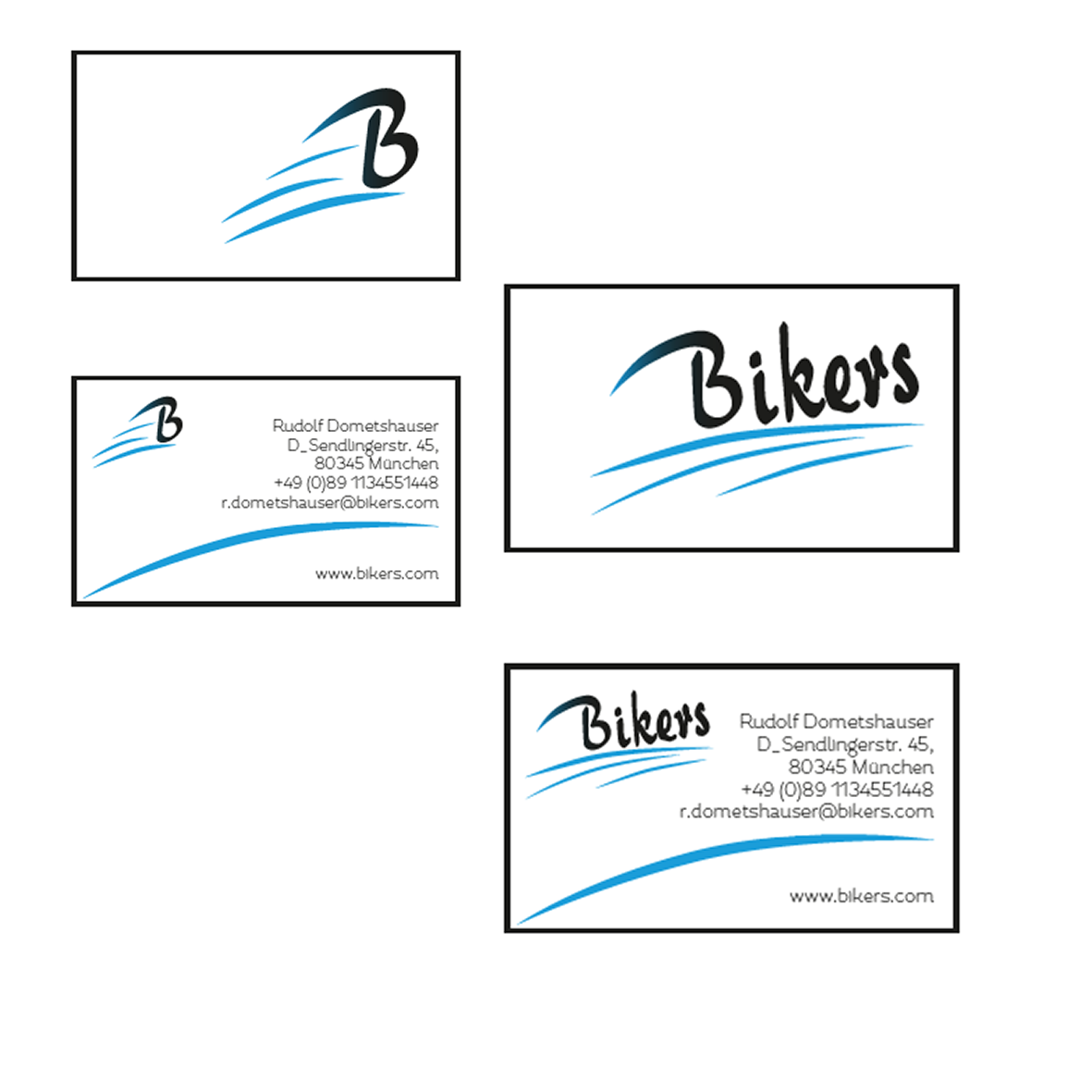
The fictional brand "Bikers" was a brand designed and targeting towards bike-enthusiasts, who are looking for the thrill of driving fast and feeling the breeze on the face.
The logo and pictures were supposed to convey that feeling. Colorwise we were looking for cool fresh colors that give off the feeling of a cool breeze while driving. Next to the new fresh look of a fast bike, the company held a lot of pride in their tradition hence the otherwise outdated looking font.
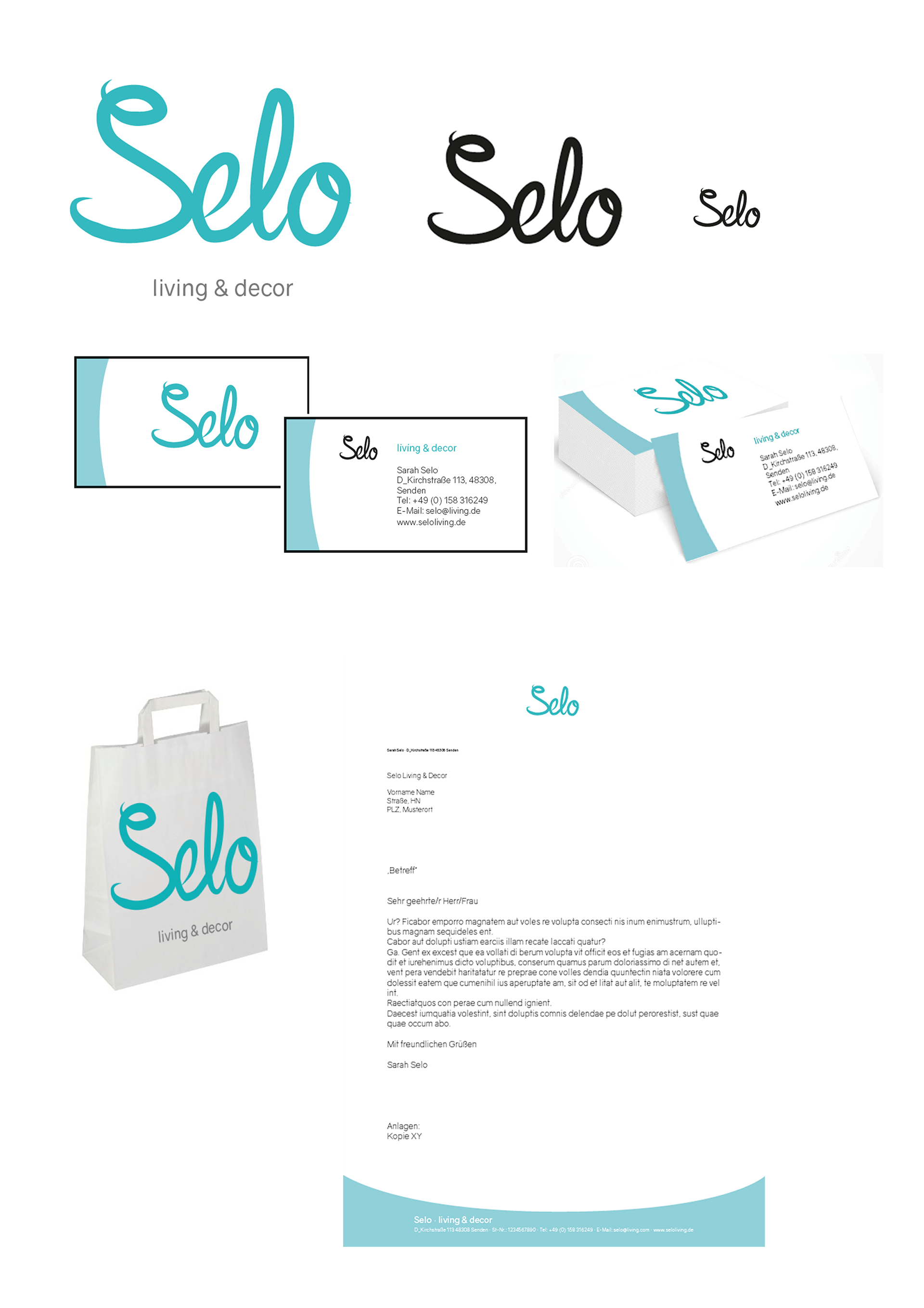
Selo was briefed as a home decor and furniture company that caters towards 70s furniting fans. Thus the style of the corporate was trying to emulate an outdated look while still feeling fresh and bringing new colors into the mix.